
Behind the Screen: How Dark Patterns Shape Digital Agency
By Ella Galmot-KerrWe spend our days moving through digital journeys. Booking a ticket. Cancelling a subscription. Accepting cookies. Uploading documents. Clicking “continue” because the alternative is hidden, confusing, or simply too much effort to find.
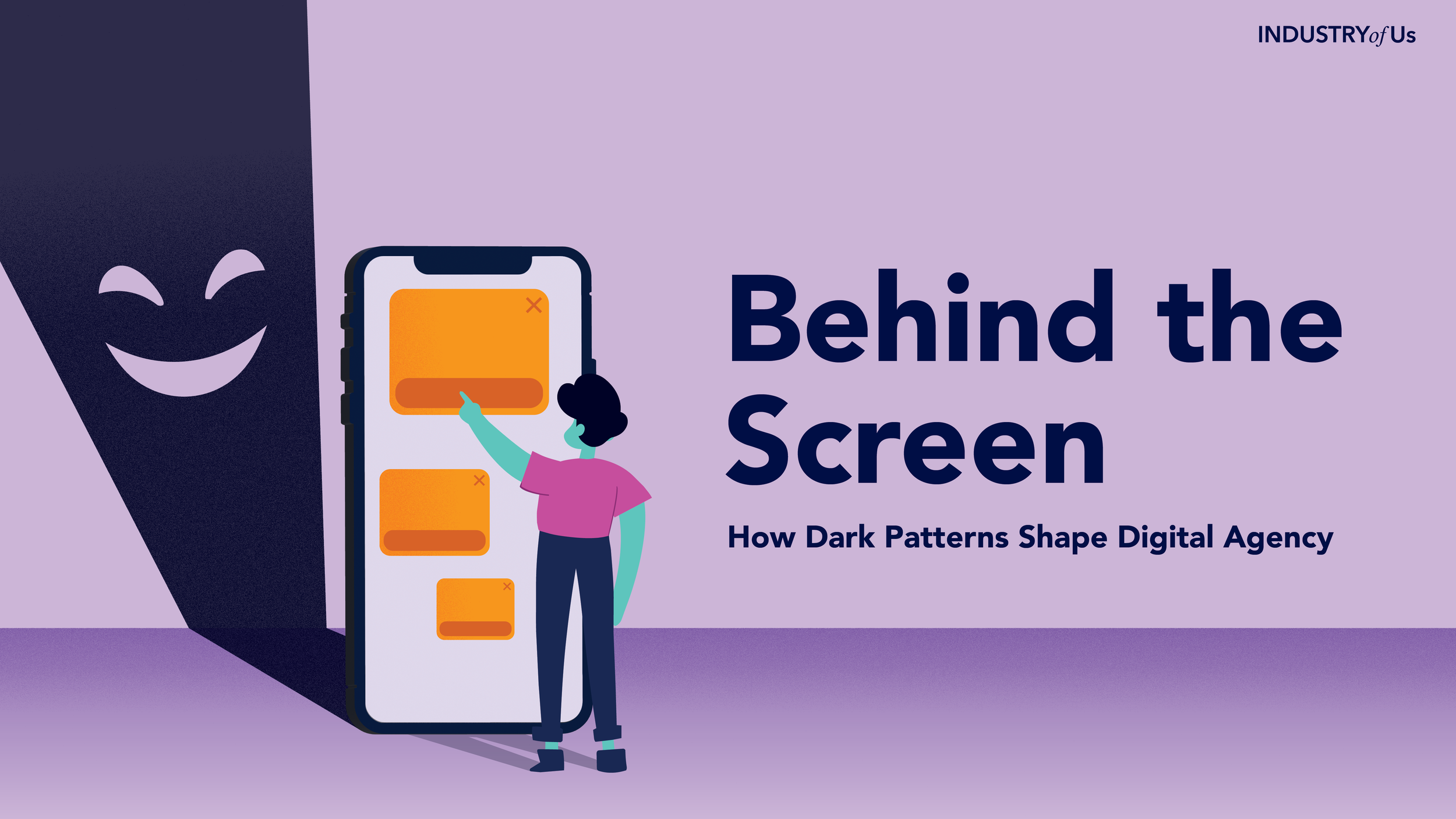
Most of the time, these interactions feel small. A button here, a pop-up there, a countdown timer nudging us to act quickly. But together, they shape how we make decisions online.
As design researchers, this makes us curious. Not just because interfaces influence behaviour, but because they reveal something important about power: who gets guided, who gets nudged, who gets protected, and who gets to choose.
Digital interfaces are often treated as neutral spaces: tools that simply organise information, guide us through tasks, and make life a little more convenient. But no interface is ever truly neutral. Every design decision shapes behaviour. A button’s placement, a default setting, a warning message, or the number of steps in a cancellation journey can all influence how much control a user feels they have.
This raises an important question for anyone working in design and innovation: when does helpful guidance become manipulation?
In this article, we explore how digital products can subtly shape decisions through what are often called dark patterns: interface choices that steer, pressure, or mislead users into actions they may not have freely chosen (Brignull, 2010; FTC, 2022). More importantly, we ask what this means for design researchers trying to build experiences that feel not only smooth, but trustworthy.
The Myth of the Neutral Interface
We often define good design through simplicity: fewer clicks, smoother journeys, less friction. But interfaces do more than streamline tasks. They shape perception, influence decisions, and affect how confident people feel as they move through a product or service.
Common dark patterns include artificial urgency, hidden fees, confusing defaults, repeated prompts, and cancellation journeys that are far harder to exit than enter. Research into online shopping found these tactics across thousands of retail websites, showing that manipulative design is not an occasional accident, but a recurring feature of digital commerce (Mathur et al., 2019).
For design researchers, this reveals an important gap between what users appear to do and what they actually experience. A completed journey does not always mean a confident user. A sign-up does not always mean meaningful consent. An exchange may tell us what happened, but not whether the user felt informed, respected, or in control.
That is where research becomes crucial. By observing behaviour, listening closely, and mapping the emotional texture of a journey, we can spot the moments where ease tips into pressure.
When Choice Isn’t Really a Choice
Dark patterns become even more troubling when users have little real ability to walk away.
In retail, a manipulative interface might pressure someone into buying faster or paying more. These moments matter. But the stakes rise when similar tactics appear in systems people rely on to access essential services, manage personal information, or complete legally significant processes.
This builds on research by Ella Galmot-Kerr, one of our design researchers, whose undergraduate dissertation explored how dark patterns can seep into state-run digital systems, where users often have fewer alternatives and the consequences of confusion or exclusion can be far more serious.
In these contexts, the user is not simply browsing. They may be anxious, time-pressured, unfamiliar with the system, or afraid of making a mistake. The interface becomes the environment through which they must prove, apply, upload, consent, or comply.
For design and innovation teams, this is a reminder that context changes everything. The same design pattern can feel helpful to one user and coercive to another. A fast journey may support someone confident and digitally literate, while leaving someone else feeling rushed or unable to pause.
This is why design research needs to move beyond the “average user.” It helps us ask: who has the least power in this journey? Who needs more clarity? Who is most likely to be harmed if the system assumes everyone understands, trusts, and behaves in the same way?
Designing for Trust, Not Just Conversion
The challenge is not to remove influence altogether. All design influences behaviour. The opportunity is to design that influence responsibly.
That means asking better questions earlier in the process. Do users understand what they are choosing? Can they easily change their mind? Are we reducing uncertainty, or using it? Would this interaction still feel fair if the user was stressed, vulnerable, or unfamiliar with the system?
For design researchers, these questions help us look beyond the visible journey. They push us to understand the conditions around the user: their confidence, their constraints, their assumptions, and the consequences of getting something wrong.
Sometimes, trust means adding the right kind of friction. A pause before sharing sensitive data. A clear warning before committing to a payment. A simple explanation of consequences before moving forward.
Friction has a bad reputation in digital design. But not all friction is equal. While some friction frustrates or excludes, the right kind of friction gives people space to think. As digital products become more personalised, persuasive, and optimised, this distinction matters. The future of innovation will not only be shaped by what we can make seamless, but by what we choose to make more thoughtful.
In Summary
Designing for agency is not about making every journey slower, heavier, or more complicated. It is about recognising that behind every screen is a person making decisions within a particular context.
As design researchers, we have a role to play in making those contexts visible. We can uncover where users feel confident, where they feel pressured, and where a product’s success metrics might be hiding a more complicated human experience.
So, next time you are designing, testing, or reviewing a digital journey, look beyond whether the user reaches the end. Ask what happens along the way. Where are they being guided? Where are they being rushed? Where might a small moment of clarity, pause, or reassurance give them back a greater sense of control?
Because the best digital journeys do not just move users from one step to the next. They leave people feeling informed, respected, and genuinely able to decide.
References
Brignull, H. (2010). Dark Patterns / Deceptive Design.
Federal Trade Commission. (2022). Bringing Dark Patterns to Light.
Mathur, A., Acar, G., Friedman, M. J., Lucherini, E., Mayer, J., Chetty, M. and Narayanan, A. (2019). Dark Patterns at Scale: Findings from a Crawl of 11K Shopping Websites.
OECD. (2022). Dark Commercial Patterns.